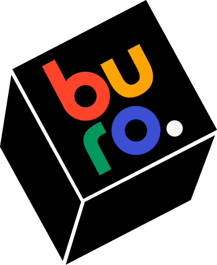
Buro S1E9 – New look for new beginning
Discover the journey of rebranding, from Desk to Buro. Dive into the visual transformation of Buro. Join us for this edition of Buro and experience the magic of the rebranding process.
Have you noticed that this Internet corner have changed? Yes! Maybe it’s because you was here for the last edition when I explained why Desk has become Buro. Otherwise, I recommend you to subscribe to Buro because a lot arrives!
Last edition, I promised you to explain what was my process for the new Buro’s Brand Identity. This mean that unlike last edition, this one will be more visual and less talkative. Without further ado, it’s time to deep dive into today’s subject.
Desk
As a reminder, I’ve passed through a lot of step in my reflexion. And when it was time for me to release Desk to the wide public, I’ve simply used the branding I made back in my last job – where I started to send emails to show the graphic references.
▶︎ The Legacy
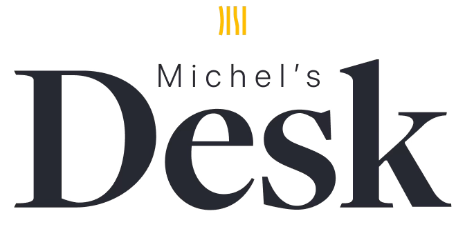
This logo is the one I used at first to my colleagues when I sent my newsletter about the last graphic trends. When I relaunched it in Substack, I reused this logo. There is a lot of chances that you’ve seen it if you’re here since the beginning. I love this logo and I’m very attached to it.
The 4 vertical bars are subtly representing the letter of DESK. I think this minimal approach gives the logo an established & high quality look. You can also feel this high quality in the woodmark – The font representation of a logo – where the Desk font is custom-made. This font has some elements of classic fonts – like Baskerville and Didot – but also a certain modernity with, for instance the shape of the ‘e’. To finish the logo, I put a touch of yellow because it is my favourite colour, it represents happiness, sun, warmth & energy. Everything I want in this newsletter 😀.
▶︎ The Cozy
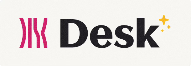
After a certain time, I wanted to explore more in the accessible aspect of the newsletter. To reach this goal I’ve created a bolder logo easier to read and I’ve changed the colour scheme from yellow to burgundy (even if I’ve kept a touch of yellow 😉).
The custom font is based on Gotham but with a twist with the contrast between the stems weight. The woodmark is more readable in small size but missed some high quality look.
I’ve though of the cream colour in the background to bring some coziness and calm in the website – The white is very bright and can be very agressive.
A fun approach but not as strong as the previous one, and don’t represent me at all.
▶︎ The Magazine
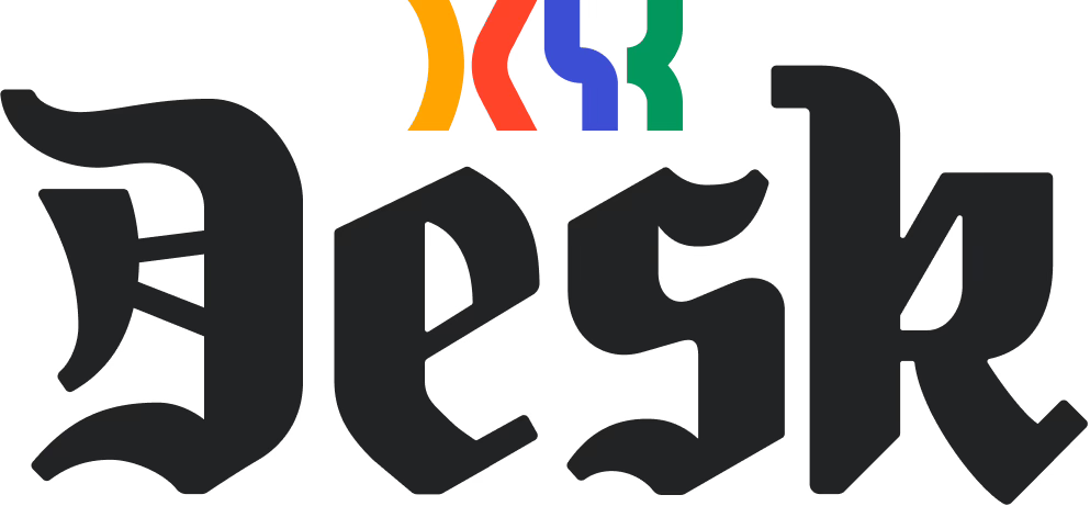
Back from my road trip through New Zealand, I’ve decided than Desk will now be a media – a way for me to express. The best way to show this change of mind and this new position is to show it, isn’t it?
The Telegraph, The New York Times and Le Monde use an Old-English font for their logo. I told myself it should be a great way to show you the new orientation. It is a great way to use the newspaper heritage and try to transcribe it into my little tiny media.
Maybe!? but where is the fun, the warmth, the crazy touch? I wasn’t completely sold on this direction. This is why I choose to go to the opposite direction.
▶︎ The Fun
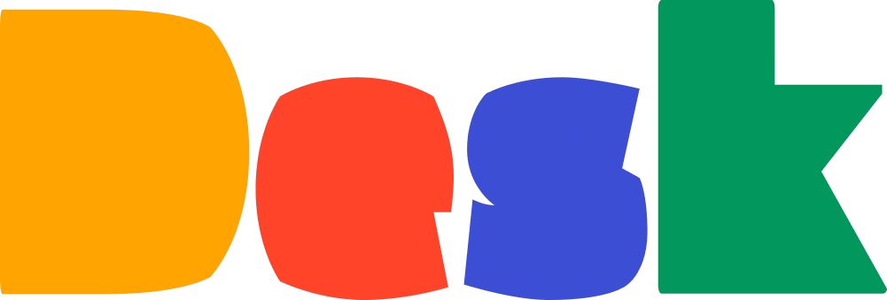
When you push the fun cursor very far, this is what you can find.
I like this colourful and playful direction. It’s a lot more approachable logo – and I can see it animated, living in a website or on multiple platforms 😁. Each letter has a lot of personalities and you can choose the level of serious by adding more corner and more squarish letters.
Buro
When I took the decision to finally change the name to Buro, I had to restart from the beginning. My mind was not completely settled on this name, so I choose to adapt all my Desk reflexion process and transpose it to the name Buro.
My first idea was obviously to recreate something similar to my favourite Desk logo. Simple and efficient. To test it, I used the New York font and after trying multiple icons, I end up to this 4 dots.
I simplified the logo and create new custom letters for Buro. I wanted to try a semi-serif font to add modernism and maybe a quirky and fun part but I wasn’t convinced. So, I’ve created a lot of custom fonts and styles.
I worked a lot in this letter designs, with each style a certain vibe.
The first one try to capture an italic font but straight like a roman.
The second one is inspired by the Bauhaus and the geometric linear fonts like Futura.
The last one is a extra-black inspiration font, I wanted to give a spirit of modernism with readability.
None of this solutions was interesting enough.
Starting from the extra-black font, I tried to go in the fun direction. Since, I really liked this approach when I worked on this with Desk, I thought it could be the best solution here for Buro. New name, new style, new orientation. So, I went further and further, in this direction. But nothing really catch what I wanted for Buro.
The Bauhaus font was quite nice, and I wanted to try something near the 4 verticals bar. I remembered the 4 dots and try to replace them by the letters. And it remind me something I already saw. Can you see it? Let me give you another clue!
And now, can you see it? It’s NeXT the company created by Steve Job with a logo designed by Paul Rand. Quite an heavy heritage, isn’t it?
But making this logo in a false 3D catch my eye and give me an idea! I took every fonts I designed for Buro and I picked the elements I like in every iteration into another custom letters designs:
A very nice font design! Between, classics and moderns fonts, very readable. I like it! Now it is time to test my idea.
Here is the final evolution line for the Buro’s logo. I took the NeXT logo as inspiration, used my custom type on it and add colours on the bottom side. The letters have to be the most readable so, they stay white.
Making the gradient make me think about layers. I tried it and loved it! I removed the shadows because it was unnecessary. I just tidy up some bits and thing. Et voilà!
What a story! I’m currently finishing this lines and I’m noticing than I’ve written a lot… again. For this edition, I wanted to be more concise and readable. But, I think it is not my biggest quality 🤣.
Maybe next time!
Bye
I hope you have enjoyed this new edition of Desk. We have now completely finished the story of the rebranding of this little Internet corner. As you can see, it was a lot of work, but I’m very pleased with this result.
In the back-stage, I’m continuing to prepare a lot of content and new concept for you. I’m very excited for the future of Buro! Hoping you have the same desire. If so, share this newsletter around you. That support my work and reward the hours I spend to write this newsletter in my non-native language. You can also comment, or send me an email if you want.
See you next time for the next one.
May the Force be with you!


